
A well-designed eCommerce website is essential for any business that wants to succeed in the digital age. Not only does it need to be easy to use and navigate, but it also needs to be visually appealing and optimized for search engines. Thankfully, there are a few simple steps that any business can take to ensure their eCommerce website is up to scratch.
Importance of Quality eCommerce Website Design
In the age of online shopping, first impressions are everything. A potential customer will make a split-second decision about whether to stay on your website or move on to the next one. This decision will be based largely on the overall design of your site. If your eCommerce website is cluttered, confusing, or not aesthetically pleasing, you’re likely to lose out on business.
On the other hand, a well-designed website will give customers the impression that your company is professional, trustworthy, and worth doing business with. In addition to affecting customer perceptions, website design also has a direct impact on conversion rates. Furthermore, a stylish and professional-looking website helps to build trust with visitors and create a positive impression of the company. This is why investing in professional eCommerce website development is one of the best decisions you can make for your business.
eCommerce UI Design Considerations
First impressions are primarily influenced by the look and feel of a website. According to research, consumers can judge if they like a website in just 50 milliseconds. When it comes to eCommerce, user interface design is important for two reasons. First, an effective UI can help to increase conversion rates by making it easy for users to find what they’re looking for and proceed through the checkout process. Second, a well-designed UI can help create a positive brand image by providing users with a consistent and enjoyable experience.
With that in mind, UI design is essential for creating a positive customer experience. Here are a few things to consider:
- Simplicity is key. The last thing you want is a cluttered, confusing UI that makes it hard for users to find what they’re looking for. Keep things clean and simple, and use clear labels and organization methods.
- Use straightforward language. Avoid jargon and “tech speak” whenever possible. Remember that not all users are familiar with technical terms, so using plain language will help them understand your UI more easily.
- Make sure various elements are easy to find and use. Users should be able to quickly locate the search bar, the shopping cart, etc. Use intuitive design principles to make these elements easy to spot and use.
- Be consistent in your design choices. Users should be able to easily navigate from one page to another without getting lost or confused. Consistency in design choices will help create a better user experience overall.
- Observe the branding guidelines. Every element of your site, from the colors you use to the way you describe your products, should reinforce the values and personality of your brand. When done right, a strong brand can be a powerful tool for driving customer loyalty and sales.
- Avoid pop-ups. Pop-up windows are annoying. Even if they include useful information, customers are more likely to disregard them right away because once gone, it can be difficult for them to locate the information again, even if they try.
- Test your UI thoroughly before launch. Have multiple people test it out and give feedback. Make sure there are no major issues that could frustrate or confuse users when they start using your site.
It’s crucial to have a website that users feel confident in. The majority of customers worry about security threats, privacy, and whether the website would safeguard their personal information by facilitating a secure transaction. They will just decide to shop elsewhere if the website doesn’t seem reliable.
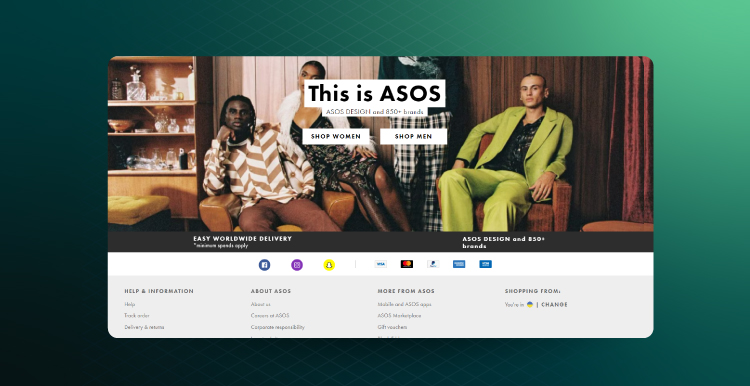
ASOS delivers excellent eCommerce UX by communicating relevant information about the company and secure payments in the footer.
Examples of Great eCommerce Website Design
One example of an excellent eCommerce website design is Amazon. Amazon’s site is clean and easy to navigate, with a search bar prominently displayed at the top of the home page. Users can easily browse through Amazon’s millions of products. The checkout process is quick and simple with various payment options, including credit cards, debit cards, and Amazon Pay.
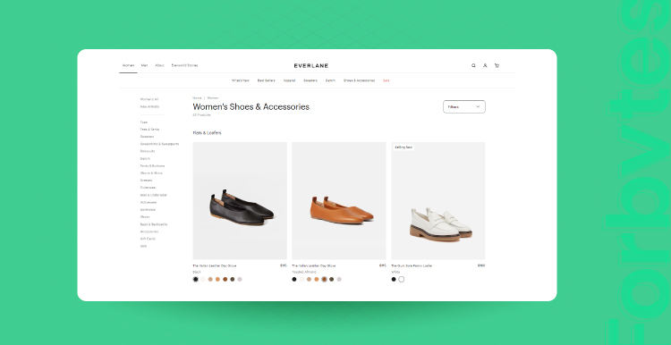
Another example is Everlane, an online fashion retailer. The site’s minimalist design makes it easy to navigate. The use of clean lines and simple colors creates a sleek and modern look.
One more excellent example is Warby Parker, an online eyewear retailer. The site’s interface is both eye-catching and user-friendly. The company’s unique approach to product photography helps set it apart from other online stores.
These are just several examples of the many great eCommerce website designs out there. By taking inspiration from these and other sites, you can create an eCommerce website that is both beautiful and functional.
Importance of Frictionless eCommerce Site Navigation
When it comes to online shopping, ease of use is key. Shoppers want to be able to find what they’re looking for quickly and easily, without any fuss. This is why site navigation is so important. It’s the backbone of the shopping experience and a crucial element in any eCommerce site design.
Good site navigation should be intuitive and user-friendly, allowing visitors to find their way around the site with minimal effort. It should also be consistent so that users can easily find their way back to the main page or previous sections they’ve visited. And finally, it should be flexible, accommodating different screen sizes and devices.
By eliminating barriers like complex menus and search functions, you can make it easier for customers to find what they need and make a purchase. Moreover, good eCommerce site navigation can also help boost your search engine rankings, as search engines favor sites that are easy to navigate.
Product Categories
One way to ensure smooth navigation is to have well-defined product categories. This means creating clear and distinct divisions between different types of products and using unambiguous language to label each category. Additionally, it’s important to maintain a consistent hierarchy throughout the site. For example, if customers are looking at products in the “T-Shirts” category, they should be able to easily navigate back to the “Clothing” category without having to start from the home page.
Product Search
Site visitors should be able to easily find the products they are looking for without having to click through multiple pages or search options. A well-designed product search feature will allow users to filter their results by price, brand, color, size, and other relevant criteria. Additionally, it should provide accurate results that are relevant to the user’s query.
Product Quick View
A good website is one that allows customers to quickly and easily find the products they are looking for without any difficulty. One way to achieve this is by implementing a product quick view feature. This allows customers to see all the relevant information about a product at a glance without having to click through to the product page. This includes the product image, price, a brief description, and customer reviews.
Quick views also make it easy to compare similar products side-by-side. By reducing the number of clicks needed to find product information, quick views can help to create a more seamless and enjoyable shopping experience for customers. As a result, they are more likely to make a purchase and come back to the site in the future.
Product Filtering
The more options offered, the more difficult it is to decide. Put filters in place to assist customers in finding the proper products. They will be able to focus on their options and go straight to the product selection they want.
Special Offers
The best deals, discounts, and special offers are always sought after by shoppers. Make special deals obvious, so customers are aware of them. Even if there aren’t significant price variations, the psychological feeling of saving money gives the impression that you are in a better position.
eCommerce Product Page Design
eCommerce product pages are designed to give customers the information they need to make a purchasing decision. To give them enough information to make an informed decision, product pages must be well-designed, include appealing visuals, and provide detailed information about the product.
Let’s go through its design step by step.
Deliver Top-Notch Product Images
Pictures are worth a thousand words, and this is especially true when it comes to product pages. Good product images can make the difference between a customer making a purchase and moving on to another site. Here are a few tips for taking great product photos that will help boost your eCommerce sales:
- Use high-quality images: Blurry, dark, or low-resolution images will turn customers off. Make sure your product photos are clear and bright and show the product from multiple angles.
- Include close-ups: In addition to general shots of the product, provide close-ups that show details like texture, stitching, or material. These kinds of shots help potential customers get a better sense of what they’re buying.
- Use lifestyle shots: If possible, include images that show the product in use. Lifestyle shots help customers visualize how the product will fit into their own lives.
The product photos on MR PORTER have zoom capabilities and even videos.
Give Just Enough Details About the Product
When potential customers visit an eCommerce website, they want to know as much as possible about the products before making a purchase. That’s why it’s important for retailers to provide detailed product descriptions on their product pages. Doing so helps to build trust with potential customers and can ultimately lead to more sales.
To start, focus on providing detailed information about the features and benefits of the product. What makes it unique? What needs does it address? Be sure to also include information about size, color, weight, materials, and any other relevant details. Customers want to see what they’re buying, so make sure your photos are clear and informative.
Make Use of Persuasive Design
The scarcity principle states that people place a higher value on things that are scarce and a lesser value on things that are plentiful. Demonstrating scarcity may instill a sense of urgency in the buying process. You can do this by showing how few items are still available, highlighting out-of-stock sizes, or posting sale dates. Lack of availability will encourage potential customers to act.
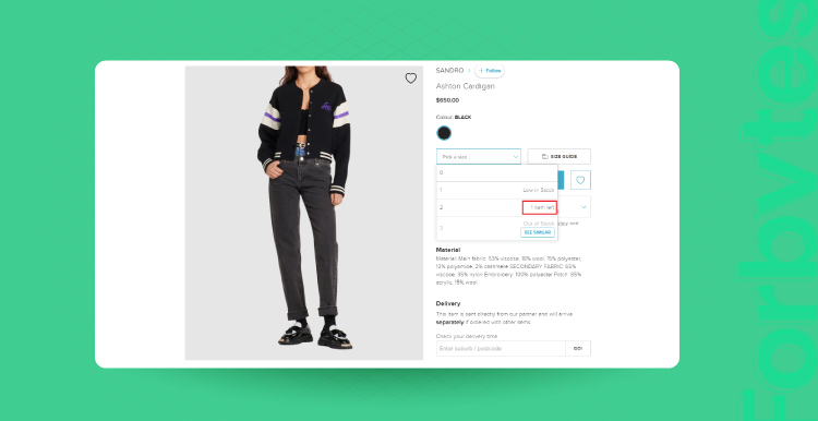
THE ICONIC creates a better e-commerce UX by providing real-time inventory information with alerting choices.
Companies are increasingly turning what was once an art into science by utilizing cutting-edge psychological research to increase engagement and sales. Persuasive design is a very effective strategy to boost conversion rates.
Show Related and Recommended Products
eCommerce product pages are designed to showcase a single product in detail. However, related and recommended products are also important in the page design. By showing visitors other products they might be interested in, businesses can increase their chances of making a sale.
Recommended products are typically displayed near the add to cart button, encouraging shoppers to add more items to their orders. Related products, on the other hand, are often displayed at the bottom of the page.
By displaying a mix of related and recommended products, businesses can give shoppers a more well-rounded view of what they offer. Ultimately, this can lead to more sales and happier customers.
Shopping Cart Design
A well-designed shopping cart is essential for any eCommerce website. The shopping cart is the heart of the site, where customers go to finalize their purchases. Therefore, it is important to design the shopping cart in a user-friendly and efficient way.
Here are a few tips for designing an effective shopping cart:
- Use a call to action that is obvious. The button for checking out should be the main call to action on the shopping cart page. Make the checkout button obvious, clear, and simple to use by utilizing vivid colors, lots of clickable spots, and uncomplicated text.
- Give appropriate feedback. Be sure to confirm a product’s addition to the shopping cart as soon as possible. Customers become perplexed by insufficient feedback, such as hidden confirmation messages. Think about utilizing animations as the human eye is drawn to movement.
- Use a mini cart to enable customers to add items to their shopping without leaving the current page. They can navigate, find, and add additional products thanks to it. The full-page shopping cart should always be linked from mini cart widgets.
- Show product information. The shopping cart’s display of information about each item, such as its name, picture, size, color, and price, aids consumers in remembering it and in making comparisons. Redirect customers who need more information to the complete product pages of the items they have in their cart.
- Make the cart simple to edit. It should be simple to remove, save for later, or alter specifics like size, color, or amount.
- Avoid getting caught off guard by unforeseen taxes and shipping fees. One of the main causes of shopping cart abandonment is unanticipated delivery expenses. Place the shipping options, taxes, cost breakdown, and anticipated delivery date upfront.
eCommerce Website Checkout Design
The checkout page is the last step in the customer’s journey, so it is important to make sure that the process is as smooth and hassle-free as possible. A few key design elements can make a big difference in the usability of the checkout page.
- Make sure your page is easy to navigate. All the important information should be displayed clearly and accurately, and customers should be able to move easily from one step to the next.
- Include all the necessary information on the page, but don’t overload it with too many options or unnecessary details. Stick to the essentials and make sure everything is clearly labeled.
- Provide several different payment options so customers can choose the one that works best for them. Include options for major credit cards, PayPal, and other payment processors.
- Make signing up optional. Making customers register for an account before their initial transaction drives them away. After they’ve made their purchase, give them a choice to register, and when you do, emphasize the advantages of doing so. Faster checkout is made possible by personal information like previously saved payment or shipping details, and registered users also get access to special deals.
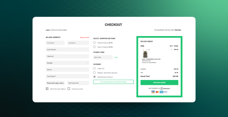
Crumpler provides a one-page checkout with a guest checkout option.
- Consider adding a few security features to help reassure customers that their personal and financial information is safe. These could include SSL encryption, fraud prevention tools, and customer service contact information.
- Offer assistance. Incorporate a live chat option or phone number into the checkout process so that customers can get in touch with you if they have any questions without needing to leave the page and look elsewhere.
By following these guidelines, you can design an eCommerce checkout page that is both user-friendly and secure.
Final Word
A well-designed website will give customers the impression that your business is professional and trustworthy, help increase sales and conversion rates, and become an essential tool for any business that wants to succeed in the competitive world of eCommerce. On the other hand, a poorly designed website will do the opposite.
Want to create a compelling eCommerce website? Leave it up to professionals. Forbytes provides robust eCommerce website development services for B2B and B2C models. We will be happy to assist you in establishing your brand online!

Our Engineers
Can Help
Are you ready to discover all benefits of running a business in the digital era?
Our Engineers
Can Help
Are you ready to discover all benefits of running a business in the digital era?