

Ensuring your website feels good to use is key to turning visitors into customers. After all, your competitors are only a quick search away, so you need to give people a reason to stay. That means keeping your eCommerce website design fresh, easy to navigate, and visually appealing.
In this article, we’ll walk through what’s shaping UX for eCommerce right now. You’ll get a clear view of the trends that matter and insights that can help you decide what’s worth adopting in your own business. Here are the UX design trends set to grow this year:
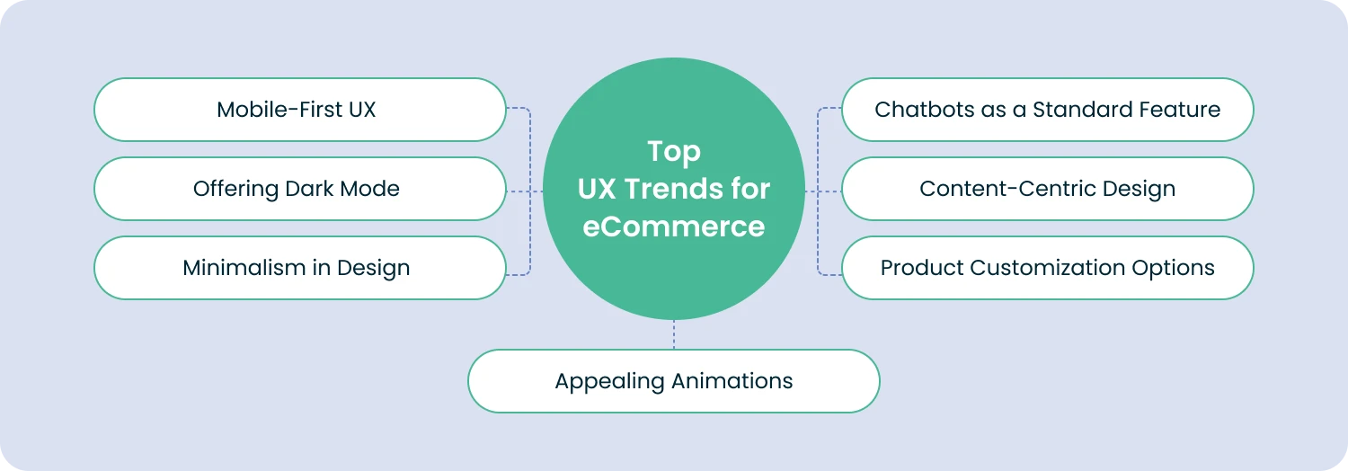
1. Mobile Is King
It’s no secret anymore: your eCommerce website has to work beautifully on mobile. Shoppers have fully embraced their phones, and the numbers prove it. In 2025, 91% of online shoppers worldwide used smartphones to make purchases. And there’s more. Companies with strong omnichannel strategies saw 9.5% year-over-year revenue growth, while those lagging behind grew by just 3.4%.
Dark mode isn’t new, but its rise in popularity definitely is. Today, more than 82% of smartphone users prefer using dark mode, which is why so many eCommerce sites now offer a simple toggle to switch between light and dark themes. Even among Apple users, about 59% choose to browse in dark mode. No surprise that apps, social platforms, and online stores are all jumping on board.
But dark mode isn’t just about looks. It actually helps save battery life, especially on OLED screens, which use more power to display bright colors. A quick example: if you watch YouTube at 50% brightness, switching to dark mode can cut energy use by around 47%. So yes, it’s a small but real way to reduce environmental impact too.
Beyond that, dark mode is great for accessibility. It can reduce eye strain, making it easier for visitors to browse your store comfortably and stay longer.
Giving shoppers the freedom to choose how they view your site adds convenience, flexibility, and a sense of control. And according to UX designers, dark mode is only going to get more popular in 2026.
3. Embracing Minimalism
Minimalism and simplicity continue to shape eCommerce UX in 2026. Think of it this way: your products should take center stage, and your interface should quietly support them.
That’s why modern eCommerce design leans toward clean layouts, lots of breathing room, bigger fonts, and straightforward navigation. It also ties into a broader UX eCommerce trend: making online stores easier and more accessible for everyone.
Minimalism follows a pretty intuitive rule. The more choices people have, the longer it takes them to make one. So trimming away anything unnecessary is key.
Keep your pages clean and focused, especially on mobile, where space is limited and attention spans are shorter. A simple, uncluttered product page tends to appeal to a wider audience than something overly decorative or complex.
To keep your UX design truly minimalistic, here are a few practical tips to follow:
- Show only what matters. Cut anything that doesn’t help the user move forward. Every element on the page should have a clear purpose.
- Give your layout room to breathe. Don’t clutter your pages with effects or visuals just for the sake of filling space. A bit of empty space makes your site feel lighter and more comfortable to explore.
- Keep things flat and simple. A restrained color palette, clean fonts, and subtle effects not only look modern but also age well. This kind of design tends to stay relevant for years.
- Use clean, uncluttered images. Crowded visuals will instantly break the minimalist feel. Aim for clear contrast and straightforward product shots.
Minimalism might look effortless, but making everything work together seamlessly takes skill. If you want your store to feel polished, intuitive, and beautiful, partnering with an experienced UI/UX designer can make all the difference.
4. Appealing Animations
Our eyes naturally gravitate toward movement, which is why animations can be such a powerful tool in eCommerce UX. They help guide your visitors, highlight what matters, and make the whole experience feel more dynamic. You’ll be seeing more of three types of animations in particular:
- Buttons. Even small button animations can make the experience feel more alive. A simple color change on click is enough to show something is happening, while more advanced effects (like a quick animation of an item dropping into the cart) add a bit of delight to the shopping moment.
- Hovers. Hover effects appear when someone moves their cursor over an element. They act like little previews, showing users what to expect if they click. Their interactive feel keeps visitors curious and encourages them to explore more of your site.
- Cinemagraphs. These are images with subtle, looping animations, often used in banners or backgrounds. Cinemagraphs add a touch of movement to an otherwise still page, giving your eCommerce site a bit more atmosphere and personality.
Using animations on your eCommerce site can bring several valuable benefits:
- Stand out from the competition. Many websites now use animations to grab attention, whether that’s through animated customer reviews, storytelling elements, or highlighting key actions. Done well, these touches can make your brand more memorable and help you rise above look-alike stores.
- Improve your SEO performance. Sites with animated, engaging UX elements are 53 percent more likely to rank higher on Google. Search engines reward sites that offer interactive, user-friendly experiences, nudging other retailers to keep leveling up their design.
- Increase conversions. If you’re looking to boost your eCommerce metrics, animations can help. They naturally draw the eye, keep visitors engaged longer, and guide them toward taking action — all of which contribute to better sales performance.
That said, not everyone enjoys motion on a page. For some users, too many moving elements can be distracting or even uncomfortable. It’s a good idea to offer an option to turn animations off so every visitor can have a smooth, comfortable experience on your site.
5. Chatbots as the Norm
Chatbots are becoming a major time-saver for businesses. Recent statistics show they can help companies save up to 11 billion dollars and almost 2.5 billion hours. It’s a huge win, especially for teams that operate around the clock with limited staff. When no one is available to jump into a chat, a well-built bot can step in and keep customers supported.
As AI has improved, chatbots have become more common and far more capable. Today, about 40% of companies across the US, Europe, and China use live chat tools to engage customers.
A chatbot can guide visitors through your eCommerce site step by step, answer basic questions, and even help them find products. In many cases, they act like digital assistants, handling routine inquiries so shoppers get what they need without waiting for a human to respond.
Businesses generally have two types of chatbots to choose from:
- Command-based chatbots. Also known as rule-based bots, these follow a script. They use pre-written answers and actions, so what they can do depends entirely on the options you’ve set up. If a user chooses a specific question or prompt, the bot delivers the matching response.
- ML-powered chatbots. These are the more advanced version. They learn from real customer experience and get better over time. Because they understand context, they can respond more naturally and handle requests that don’t fit neatly into predefined scripts.
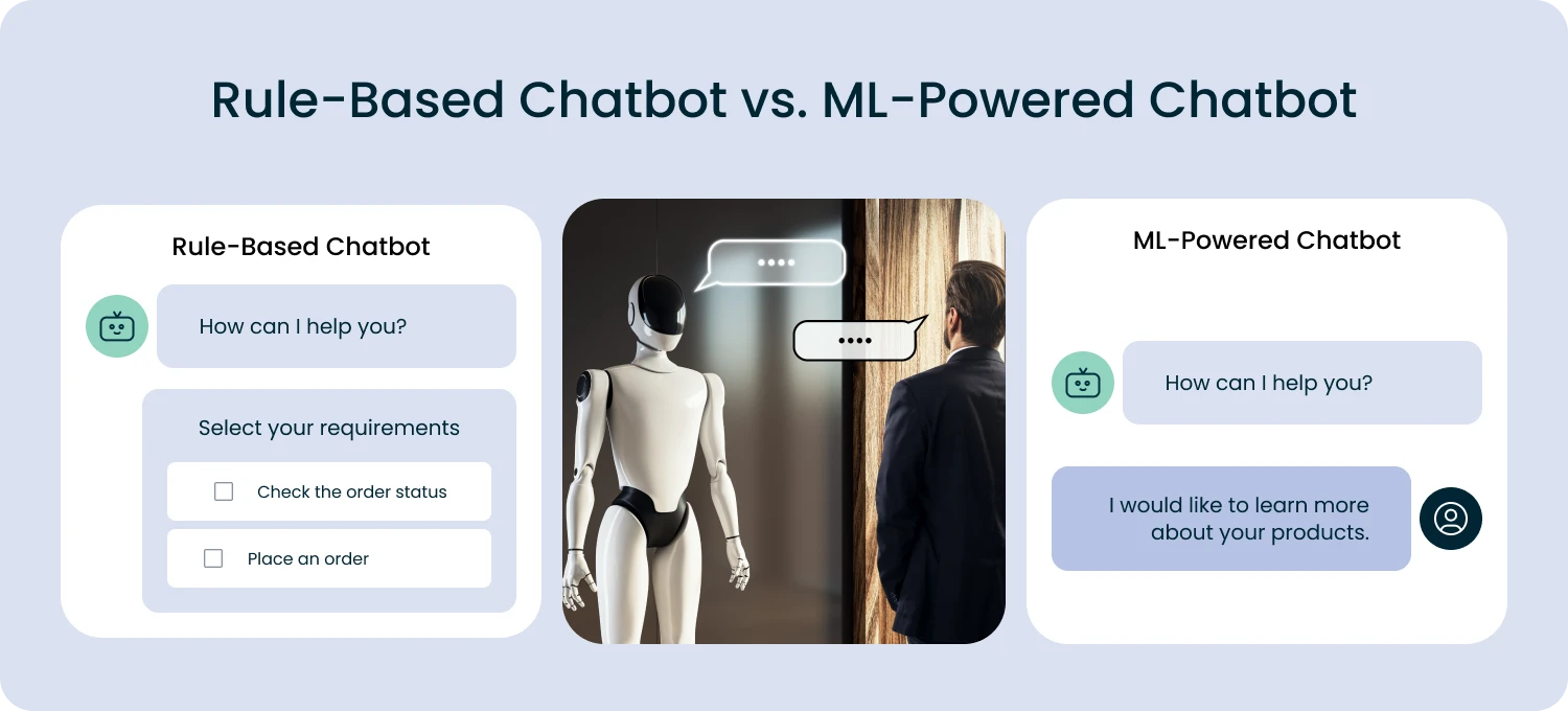
Both types can take on tasks that would normally fall to a customer service agent. They answer questions, help shoppers find products, and guide them through the site. Some even analyze user behavior to offer more personalized support. With capabilities like these, it’s no surprise that chatbots have become one of the biggest trends in eCommerce app design this year.
6. Content-Centric Design
Your website shouldn’t just promote your products. It should also inform, educate, and genuinely help your customers. That’s where content comes in. Blog articles, guides, and useful tips can do a lot for your store, from drawing attention to your products, to explaining what makes them great, to offering advice shoppers actually care about.
In eCommerce UX, content is becoming an increasingly important part of the experience. Instead of treating it as an add-on, many brands now use content as a core promotional tool. Done well, it creates a smoother, more engaging journey for your visitors and makes your products feel more appealing.
Here are a few things that define this growing trend:
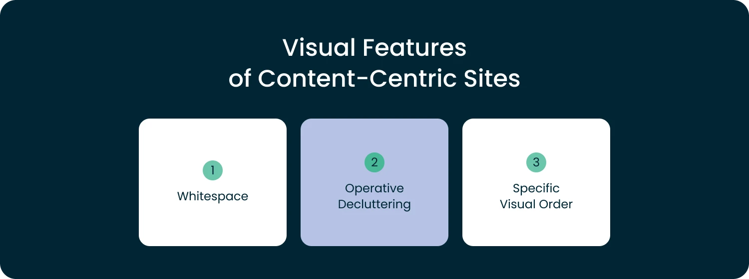
- Balance your content with space. We’re all surrounded by content every day, so it’s easy to think that more is always better. But in eCommerce design, the opposite is true. Your pages need breathing room. A good balance of whitespace and text helps users pause, absorb information, and move comfortably to the next section. How much content you actually need depends on your niche, so it’s worth checking what top competitors are doing to see what works in your space.
- Cut the clutter. Take a close look at your content and remove anything that doesn’t serve a purpose. Too much filler makes the page feel overwhelming. Keep the meaningful parts and let your users focus on what really matters.
- Follow a clear structure. A well-organized layout helps people navigate your store without thinking twice. A UX expert can help you understand how visitors behave and how to place elements where they naturally expect them. For instance, most users look for a search bar in the top right corner and a home button in the top left — simple conventions that make their experience feel intuitive.
And here’s where content really shines: imagine reading an article about a product and being able to add it to your cart right there without leaving the page. Many stores now make this possible through interactive images and embedded product links. This kind of content-centric design creates a smooth, seamless shopping experience your customers will appreciate.
7. The Opportunity to Customize Products
Giving customers the option to customize products can completely elevate their shopping experience. Letting people choose colors, sizes, shapes, or designs makes the product feel more personal. After all, it makes the entire journey feel more fun. When shoppers can preview what their customized item will look like, they feel more confident and more connected to what they’re buying.
Of course, offering customization isn’t something you set up overnight. It takes planning, development work, and thoughtful UX. Bringing in a UX professional is often the smartest move. They can help turn your ideas into intuitive, easy-to-use features that your audience will genuinely enjoy.
Boost Your eCommerce Growth with Smarter UX
In this article, we explored the key UX trends shaping eCommerce and why they matter. At the end of the day, great UX is what turns curious visitors into loyal customers. And that applies just as much to online stores as it does to physical ones.
By keeping up with UX trends and adapting them to your business, you can turn your eCommerce website into a place people enjoy visiting — and returning to.
If you’d like a hand refining your eCommerce UX or polishing your system design, feel free to reach out. We’re always happy to help your website look and feel its best.

Our Engineers
Can Help
Are you ready to discover all benefits of running a business in the digital era?
Our Engineers
Can Help
Are you ready to discover all benefits of running a business in the digital era?