
There is a 60% probability that you are reading this article on mobile. Why so? As of June 2022, more than half (60.46% precisely) of Internet traffic comes from mobile devices. Just think of it: by optimizing your website to mobile, you get the chance to reach 60% more clients. This should be taken into account by online businesses that want to generate a stable profit.
In this article, we discuss mobile site optimization as a way to reach a broader audience. But first, let me share a couple of interesting facts about the technology miracle which you daily carry in your pocket.
Greater than a Spaceship?
In 2018, Apple sold 217.72 million iPhones across the globe, which is more than 596 000 iPhones daily. Apply your counting skills and you’ll find out that in 2018, Apple was selling 7 iPhones per second! What an impressive achievement it was. And no need to say it was well-deserved.
Indeed, after the release of the first iPhone in 2007, Apple started a big revolution in the market. Here came the competitors: other companies joined Apple’s effort to build an innovative product and began to release their versions of smartphones. As a result, we now have lots of options ranging in price and functionality that satisfy the needs of the most demanding users.
On top of that, today’s mobile devices are more powerful than spaceships. Their chips and processors perform much more computing than was needed to power Apollo 11 to enable its landing on the Moon. Businesses should not underestimate the power of this tiny device — a well-designed mobile-optimized site can generate no less (and even more) profit than desktop solutions.

Mobile vs. Web Traffic
In the last 10 years, mobile traffic is steadily growing:
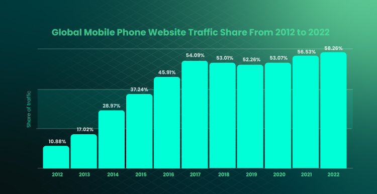
If you check what the situation was 10 years ago, you’ll see that mobile traffic stood only for 10% of Internet traffic globally. The promising tendency of mobile growth shows an increase of more than 50% — Jun 2017 marking the highest rise in mobile development history.
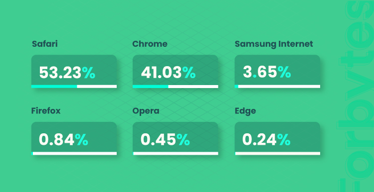
In the US, we witness a similar tendency. As of June 2022, 52.79% of traffic comes from mobile. The most popular browser for mobile usage is Safari (53%), followed by Chrome (41%) and Samsung Internet (4%).
Interestingly, in 2021, there were 6.4 billion smartphones in the world, meaning that more than 80% of the world’s population own one and use it for accessing websites (including yours). Businesses try to grasp the opportunities that mobile optimization gives them and look for ways to make their websites mobile-friendly. Trip Hawkins, the founder of Electronic Arts and The 3DO Company, once said, “We will continue to see more innovation on the Internet and mobile phones than on consoles.” And he was right.
Considering all the mentioned, can there be a better time to support a mobile-centered strategy and earn benefits from it? The best decision is to start here and now.
Why Is Optimizing for Mobile Important?
Let’s present some statistics:
- A client is four times more likely to go to a competitor if they face service-based difficulties on your site. The data provided by HubSpot prove the importance of adjusting your services to different categories of customers. Considering the growing number of mobile visitors nowadays, your ecommerce website must be fully optimized for a mobile device.
- 94% of all Google searches in the US are done via mobile phones. Interestingly, a great part of the searches is done when people are at home or the office. In such places, people are likely to have computers, but they still prefer to use their smartphones to make requests in search engines.
- If your page loads slowly, it can result in 97% mobile shopping cart abandonment. How slow is too slow? Google estimates that visitors will give your website 3 seconds to load before moving on to “greener pastures”. The mobile experience can be what makes or breaks a deal.
The market tendencies and figures are pushing businesses to look for effective mobile site optimization tips and even launch mobile-first development projects. Now, let’s look at what you’ll get if you decide to go for mobile website optimization:
- Your customers won’t abandon your website due to frustration. Turning up in search results is, of course, important to help new visitors find you. However, it is equally important that they stay on the website and see what you have to offer. The mobile view of website should encourage clients to make a purchase, not frustrate them. There is less freedom of navigation and less screen space when it comes to mobile. This should be taken into account, particularly when developing pages for making and processing orders and doing the checkout. The more customers stay on your website at these stages, the higher the profit.
- Search engines will rank your mobile optimized website higher in search results. Some time ago, the only thing you had to care about was regular SEO. But today, the latter highly depends on mobile SEO. Mobile SEO, in turn, is determined by how well your website works for mobile users. User-centric companies like Apple or Google realized the importance of mobile in as early as 2012-2015. In 2015, Google released a search engine optimization algorithm called Mobilegeddon. The algorithm prioritizes mobile-optimized websites and gives them high ranks in search results.
Do I Need Mobile Site Optimization?
How do you know if your website is up to par? How urgent is it?
Google Analytics can show you which devices your visitors are using. Underneath the tab named Audience, you will find Mobile. Under Mobile, choose Overview. Here, you will see how many mobile and desktop users you have. What’s more, you can also see important data such as the bounce rates and length of session durations for these devices.
If you find that the bounce rate for mobile users is significantly higher than that of desktop users, you have a problem.
P.S. If you have no Google Analytics installed for your website, here is a quick tutorial on how to do it.
How to Know if It’s Time for Website Optimization
Apart from data in Google Analytics, you can make use of different tools to detect what is wrong with your website optimization. Here are some tips on how to find out why mobile commerce performs poorly. These are free resources readily available, and they will audit your website and let you know about any shortcomings.
- Google’s mobile-friendly test is an instrument of Search Console that will have a look at the mobile view of website and let you know if it is suited for mobile users. All you need to do is to enter your URL address and go through critical issues of your website if any. If your page is mobile-friendly — well-done!

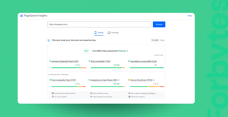
- PageSpeed Insights analyzes your website’s mobile and desktop computers’ versions. It provides you with a grade out of 100 and feedback on how to improve your solution. If you have an issue on the desktop related to the page speed, that same issue will likely turn up on mobile. The tool will give you tips and suggestions on how to optimize the website. But you may need a tech background to boost your website’s performance. In case you seek help with this, request an IT consultation with our mobile solution experts.
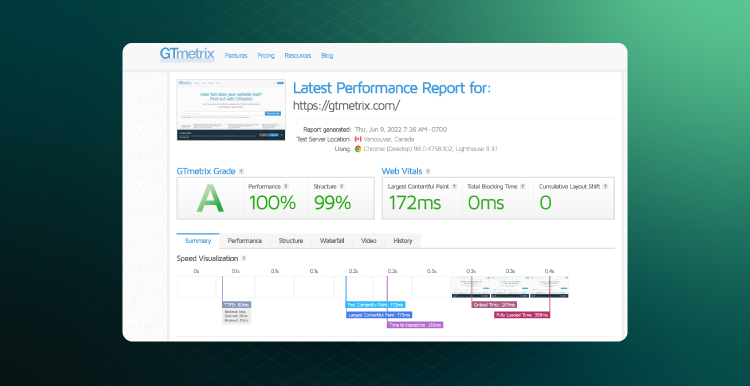
- GTmetrix reviews your website and grades it in comparison to the average website. You can adjust the testing process to your audience’s specifics and check how your responsive site performs in different browsers, countries, connection speeds, and more. The tool will also provide you with some feedback on the aspects that need improvement.
Also, remember to run some of your competitors through these tests and compare the results. If their mobile sites are performing poorly, then you have a great opportunity on your hands. If you are falling behind, then you need to work on catching up. Keep reading to find out how to optimize a website to generate higher ecommerce profit.
How to Optimize Website? 5 Tips
1. Choose Mobile-Friendly Tools
Starting from the choice of web host to configuring website features — at each stage, you need to think about how the changes affect the website look in the eyes of Internet users. If you are using WordPress, the choice of themes and extensions is no less important.
When selecting a WordPress theme, make sure that it looks appealing on both desktop and mobile. The theme has to be responsive. To do this, look through the theme’s description carefully before installing it. Usually, developers outline the theme’s key features and capacities when it comes to mobile.
2. Think Small Screen
When analyzing web design optimization, your focus should be put on ease of use and consistency.
The fewer actions a customer must take to complete a transaction, the better. If your web design optimization wasn’t done with this in mind, it might be worth considering changing the UI UX design itself.
However, some issues pop up more frequently than others, even on otherwise well-designed mobile sites. Luckily, many of them are easy to fix even if you are not a programmer.
Images
Optimizing images is of utmost importance. Image size and format can make a huge difference to your responsive web design. Nobody wants grainy low-resolution images. However, large and high-quality images take a long time to load and will slow down the speed of your website considerably.
Therefore, make sure that the images on your website look nice but are not larger than they are displayed on the website. Using a 2000×2000 pixel image and displaying it at 200×200 pixels means it is going to take a lot longer to load than necessary. Additionally, use next-gen formats such as JPEG 2000 rather than regular JPG, as they compress the images more efficiently.
Fonts
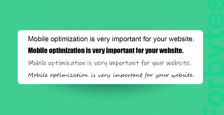
If you want visitors to read the information that you have written, you must make it easy for them to do so. Some fonts are simply difficult to read, especially in long paragraphs. Cursive fonts might be pretty, but they are going to slow down the visitor’s reading speed. Fonts such as Helvetica and Arial are easier to read for everyone, including people with dyslexia, and are frequently used for building a responsive design.
Font size is also important. Nobody likes squinting while they read, after all. If visitors have to zoom in on the page to be able to decipher the text, then you need to make changes.
Colors
The first thing that most visitors will notice once your website loads is the color scheme. Bright yellow on a magenta background won’t win you any design contests, but there are other reasons why the colors on your website matter.
It is, simply put, a matter of accessibility. People with color blindness or low vision often find low-color-contrast websites difficult to navigate. Similarly, a contrast that’s too strong risks giving your visitor a headache.
Interactive elements
It is quite common that a well-designed desktop version of a website adapts poorly to the small, narrow screens of mobiles. Additionally, most users have a harder time navigating when their finger is covering part of the mobile screen. So, don’t cramp up your buttons and other interactive visual elements. Leave some screen space around them, your mobile users will appreciate this.
3. Put UX First
The user experience should be at the center of your attention when building a mobile version of your website. If you are looking for a solution that will help you with this goal, consider Accelerated Mobile Pages (AMP) by Google. This magic tool helped Washington Post increase mobile users’ return by 23%. Let’s review what makes it special.
AMP allows you to build mobile-friendly pages by removing unnecessary content and media files to ease navigation and the perception of the website’s intent. A good way to make sure that everything works well is to test your mobile-friendly site with real users. And this is also possible within the AMP framework. If you are using WordPress, you can find the AMP plugin there and get all the basic features of this tool in your CMS.
4. Stay Laconic
Do not get too far with visuals and interactive elements. When you look at them through a desktop screen, such elements may impress. But the behavior of a mobile user is more goal-oriented compared to the desktop.
There is no time and space for implementing all design ideas when it comes to mobile. This is why you need to stay laconic and display only the elements and buttons that take a user closer to their end goal. This also relates to the design of push notifications and pop-up messages. When it comes to mobile, Google requires your pop-ups to be nonobstructive, useful, and easy to close.
5. Make It a Habit
Caring about mobile optimization should be your habit. As soon as some changes appear on your website, make sure that they are well-adjusted to mobile. For this purpose, regularly take the following measures:
- Compress images. High-quality images weigh too much and increase the loading time. As you remember, you are given 3 seconds on average for your website to load. Otherwise, you may lose a visitor. What’s the solution? To use image compressing tools (there are lots of them available for free). These tools allow you to decrease the image weight with minimum compromise on quality.
- Keep your code clear. Both e-commerce and m-commerce benefit from it. Remove useless elements from your JavaScript, CSS, and HTML. Minifying the code will help a device quickly process the code and decrease page loading time.
- Update your software. New OS editions come every year, along with new tools, apps, and algorithms. You need to keep pace with changes and regularly update your mobile-friendly website. Off-the-shelf m-commerce solutions release improvements and updates with mobile in mind. Thus, do not waste the opportunity to get updated if you are confident in the reliability and security of a new release.
Ready for Robust Optimization?
The average time users spend on mobile impresses. For example, as of February 2021, the figure in the US was 5-6 hours. If we assume that the average person is active at least 12 hours out of 24, we’ll see that nearly half of this time can be spent on mobile. With such important stats, you need to consider a mobile-first strategy for your project.
If you already have a website or another piece of software — you should adjust it to the demands of the mobile audience. In the time of big data, there is no need for empty promises. Record the data you have before optimization, optimize your website, and see how the metrics improve. Nothing vague — only facts and precise results.
And if you need help with doing this, welcome to the Forbytes world, an expert space where you’ll always find a helpful hand.